



Product & Interface Design
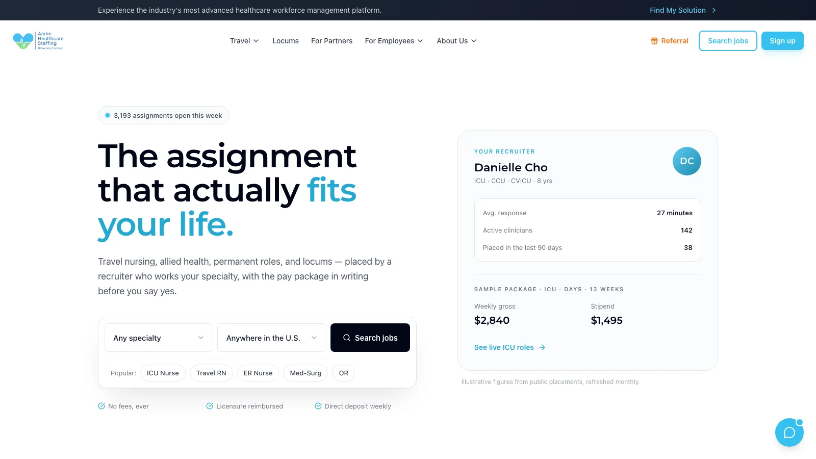
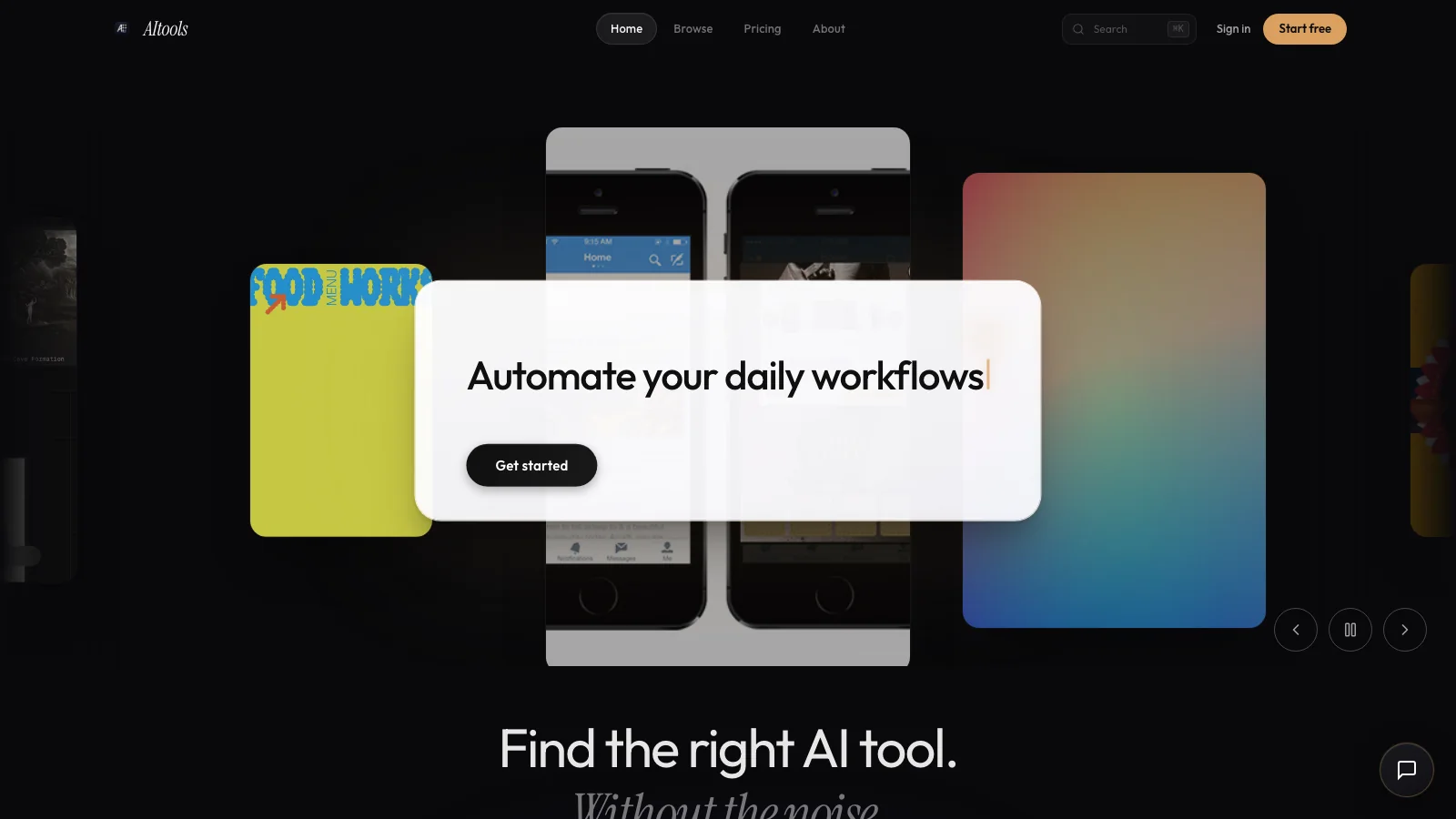
Loan applications, staffing portals, LMS dashboards, video editors — the work we design has state, permissions and failure modes. We design for those, not for the happy path.




The hard part of product design is everything after the happy path.
Empty states, partial data, three user roles looking at the same screen — that is where products actually get judged.We map the roles, the states and the hand-offs first. A referral tree, a loan application and an onboarding packet are all flow problems before they are visual ones.
Screens are designed against the components you will actually ship — Tailwind, MUI, gluestack — so the build does not quietly redesign the design.
Tokens, spacing, type scale and a component inventory, documented enough that the next engineer does not invent a seventh button style.
You click through the product before it is built, which is the cheapest possible place to discover that step four is wrong.
How the design work runs
Short loops with something clickable at the end of each one.
[01]
Map
Roles, permissions, states and the routes between them, drawn out and agreed before anything is styled.
[02]
Sketch
Low-fidelity screens for the whole flow, fast enough that throwing three of them away costs nothing.
[03]
Design
High-fidelity screens including the states nobody demos: empty, loading, denied, expired, over-limit.
[04]
Hand off
A prototype, a component inventory and the spacing rules — handed to whoever builds it, us included.
3 live products used this